I had a few goals for this design. Unlike the last redesign, I wanted to use color and images. I’ve been trying my hand at photography, and thought I’d try to incorporate something from that. Also, I wanted to really increase the prominence of my del.icio.us bookmarks, since that’s where the activity seems to be recently.
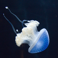
A trip to the Monteray Bay Aquarium netted me a handful of good photos, with some of the jellyfish being the best. And, since the nautical theme fits in with the (declared) pirateliness of this blog, I figured I’d give it a shot. I actually tried the photo of the black nettle first, but couldn’t get the color palette right. This blue jellyfish had some workable colors, and a few Photoshop filters later I had an image for the upper left.
There are a few things left that I’d like to clean up. I kind of punted on the style for the comments, and I don’t have anything at the bottoms of the pages to amuse and delight visitors. In particular, I’d like to put links to other posts, so folks who come in through search engines can easily get to some of the worthwhile stuff I’ve written. I also may sprinkle a few little icons here and there, too, but I’m kind of sick of messing with images right now.
